

Printing is more than just putting ink on paper; it’s a delicate dance between art and science. In this digital age, where everything seems ephemeral, the significance of a well-crafted print endures. Whether it’s a business proposal, a creative masterpiece, or a cherished photograph, the precision of printing plays a pivotal role in conveying messages effectively. Let’s embark on a journey into the world of printing precision, where each impression tells a story.
The Evolution of Printing: From Gutenberg to the Digital Era
Printing has come a long way since Johannes Gutenberg introduced the mechanical movable-type printing press in the 15th century. The evolution of technology has transformed the way we put words and images onto paper. From traditional letterpress printing to the modern digital printers, the quest for precision has been relentless.
Gutenberg’s Ingenious Invention
Gutenberg’s printing press revolutionized communication, making books more accessible. It was a leap forward in printing precision, setting the foundation for centuries of advancements.
The Rise of Offset Printing
As technology advanced, offset printing emerged, allowing for sharper images and more vibrant colors. This marked a significant step toward achieving higher print quality.
Digital Printing: A Paradigm Shift
The advent of digital printing brought about unparalleled flexibility and efficiency. Printers could now reproduce images with astonishing precision, opening new possibilities for businesses and artists alike.
The Anatomy of Precision: Understanding Print Resolution
When we talk about printing precision, the term “resolution” takes center stage. Resolution determines the sharpness and clarity of an image, and it’s crucial to achieving high-quality prints.
Demystifying DPI (Dots Per Inch)
DPI is the magic number in printing. The more dots per inch, the finer the details in the print. Understanding this concept is key to unlocking printing precision.
The Role of PPI (Pixels Per Inch)
In the digital realm, PPI matters. It determines the image’s quality before it meets the printer. Balancing PPI and DPI is an art that can make or break the precision of your prints.
Choosing the Right Paper: Where Texture Meets Technology
Precision isn’t only about the printer and resolution; the choice of paper plays a vital role in the final output. Each paper type adds a unique touch to the printed material.
Matte vs. Glossy: Aesthetic Appeal
The age-old debate – matte or glossy? Each has its charm. Matte offers a subtle, sophisticated look, while glossy adds vibrancy and a touch of glamour. Choosing the right one depends on the impression you want to create.
Textured Paper: Adding a Dimension
For those who crave more than smooth surfaces, textured paper is the answer. It adds depth and character, enhancing the tactile experience of printed material.
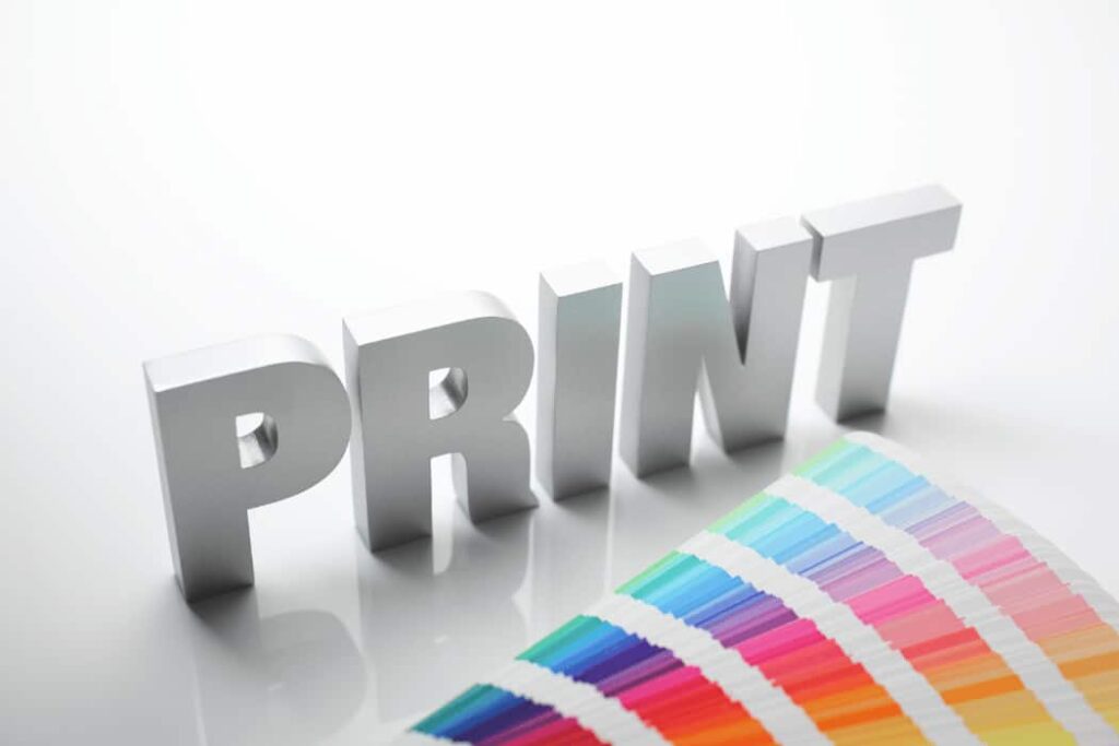
The Color Conundrum: Achieving Vibrancy and Accuracy
Color is the soul of printing. Achieving accurate and vibrant colors requires a careful calibration of the printer and a keen eye for detail.
Calibrating Your Printer
A well-calibrated printer is a prerequisite for printing precision. Adjusting color profiles ensures that what you see on the screen translates faithfully onto paper.
The Pantone Palette
For businesses and designers, the Pantone Matching System (PMS) is a color bible. Using PMS colors guarantees consistency across different prints, maintaining brand integrity.
RGB vs. CMYK: Navigating Color Spaces
Understanding the difference between RGB and CMYK is crucial. While RGB is for digital displays, CMYK is the standard for print. Converting colors appropriately ensures your prints look as vibrant on paper as they do on screen.
Beyond the Pixels: The Importance of Vector Graphics
In the world of printing precision, vector graphics reign supreme. Unlike raster images, which rely on pixels, vectors use mathematical equations, ensuring scalability without compromising quality.
Vector Graphics Explained
Vectors are the architects of sharpness. Understanding how vector graphics work is essential for achieving clean lines and crisp text in your prints.
Mastering Typography: Where Fonts and Readability Converge
Typography is more than just choosing a font. It’s about creating an aesthetically pleasing and readable composition.
Serif vs. Sans Serif: The Eternal Debate
Serif fonts exude tradition and formality, while sans-serif fonts offer a modern, clean look. Knowing when to use each ensures your message is conveyed with the right tone.
Kerning and Leading: The Spaces Between
Adjusting the spacing between letters (kerning) and lines (leading) might seem subtle, but it can significantly impact readability and overall visual appeal.
The Finishing Touch: Binding and Presentation
Precision doesn’t end with the print; how you present and bind your material is equally important.
Perfect Binding vs. Saddle Stitching
Choosing the right binding method depends on the project. Perfect binding is ideal for thick volumes, while saddle stitching suits smaller publications. The choice contributes to the overall durability and aesthetic appeal.
Embellishments: Foil Stamping and Spot UV
For that extra touch of luxury, consider embellishments like foil stamping or spot UV. These add a tactile and visual element, making your prints stand out.
Conclusion: Crafting Impressions That Last
In the realm of printing precision, every detail matters. From the choice of paper to the calibration of colors, each decision contributes to the final impression. As we navigate the ever-evolving landscape of printing technology, the pursuit of quality remains constant. So, the next time you hit that print button, remember – it’s not just paper; it’s a canvas for precision and creativity.